hbk: brand identity & packaging
He had already made a logo himself that illustrated his thoughts but he knew he needed something more, though wasn’t quite sure what was missing.
His dream was to create a community for experimental electronic music lovers who were looking for something more than just pop music. He wanted to inspire listeners and musicians to question the rules, to go beyond conventions and to get to the heart of the sound.
the problem:
In fact, it’s the opposite. Most listeners and even hardened musicians would wave it off as being ‘noise’ or ‘nonsense’ without giving it a second thought or wondering what it was about.
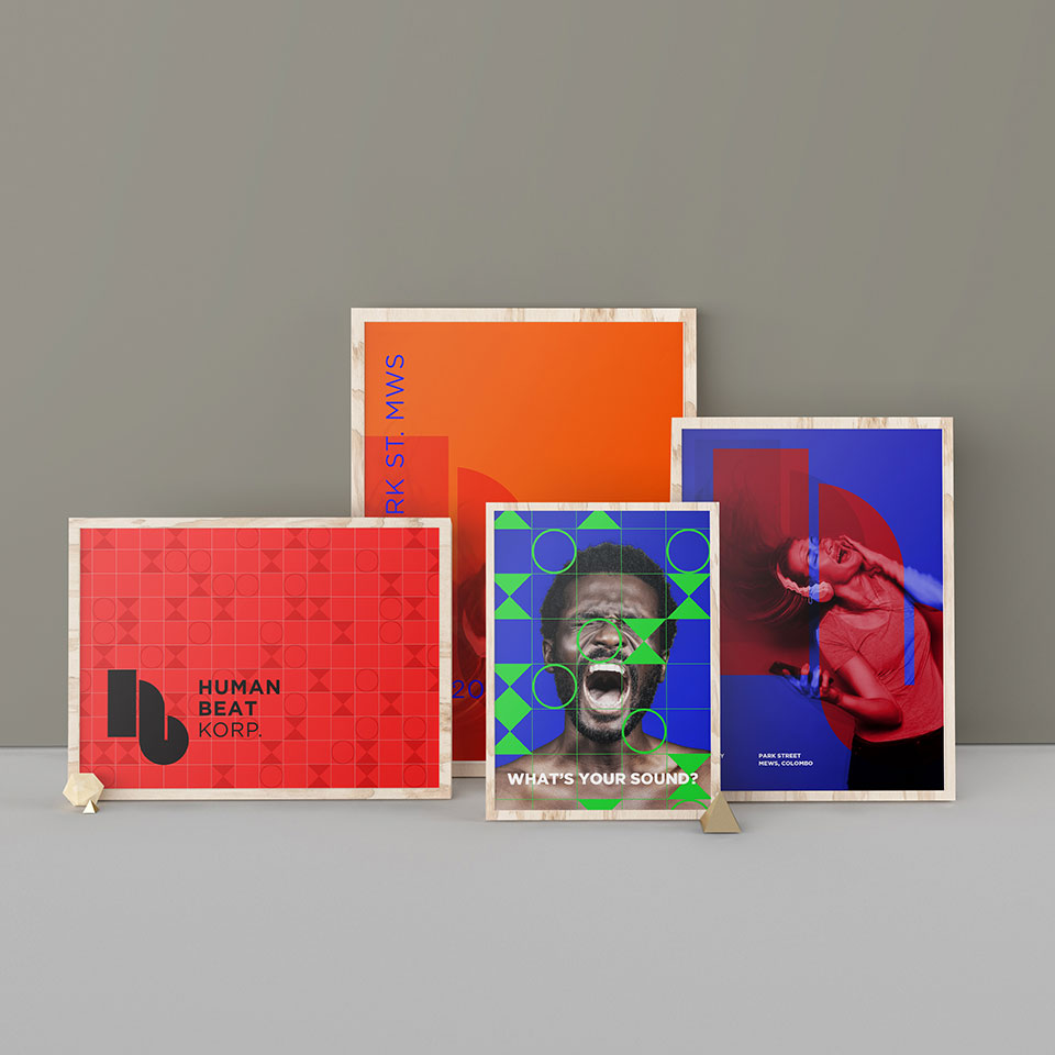
the solution:
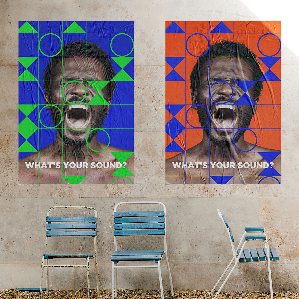
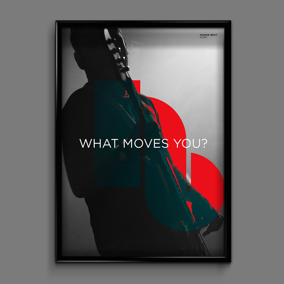
Human Beat Korp. didn’t need everyone to love them, their philosophy or their music. But they needed to be a lighthouse to anyone on a journey of musical and personal discovery looking for answers to similar questions. In order to do so, they had to communicate their ideology as simply and plainly as possible.

the solution:
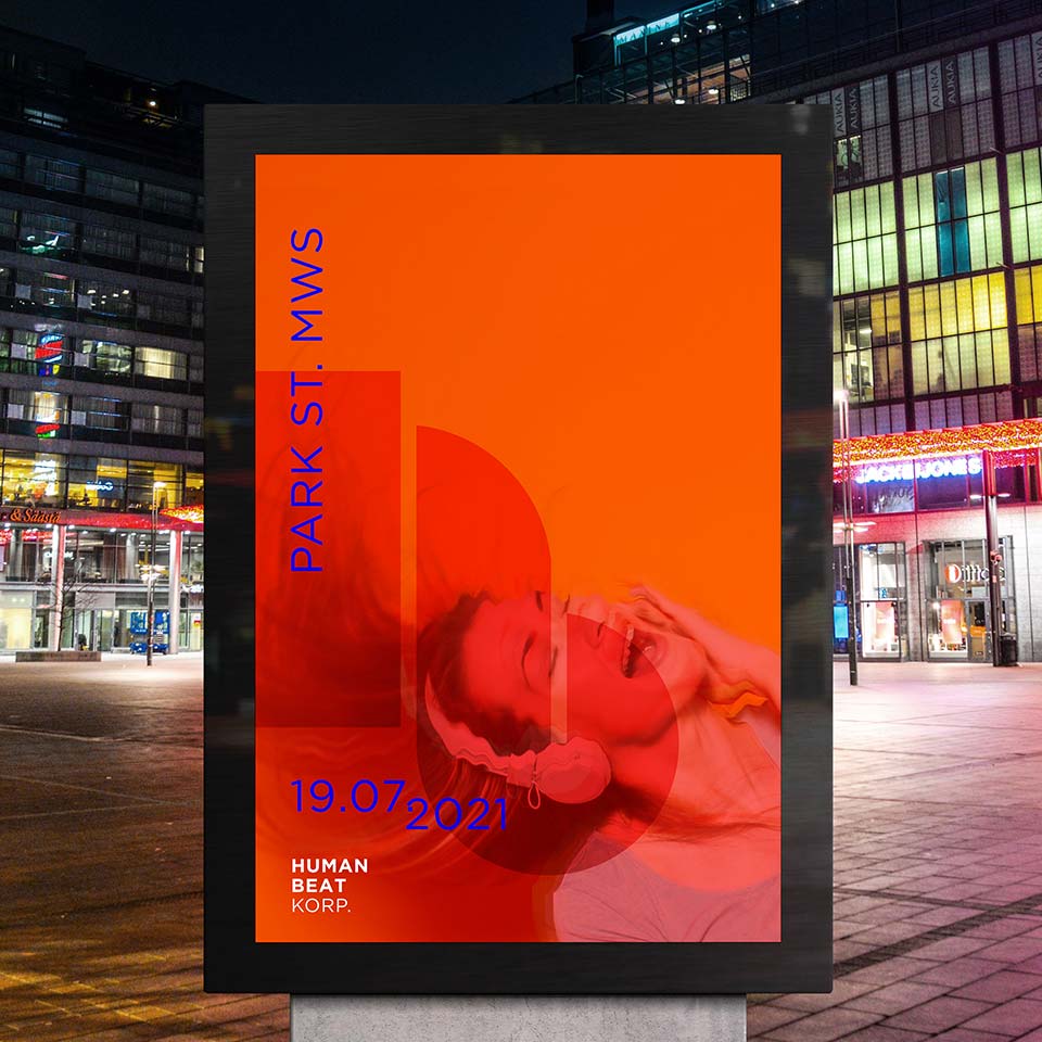
that all experimental music was nonsense and noise, it was important to show the side of the brand’s personality that encouraged deeper thinking and personal discovery. By speaking to the viewers as equals and connecting on a more personal level, it would in turn garner mutual respect and courtesy towards the brand and therefore, its followers. This was important so that they wouldn’t mistakenly be labeled as rebels, but rather as thinkers.
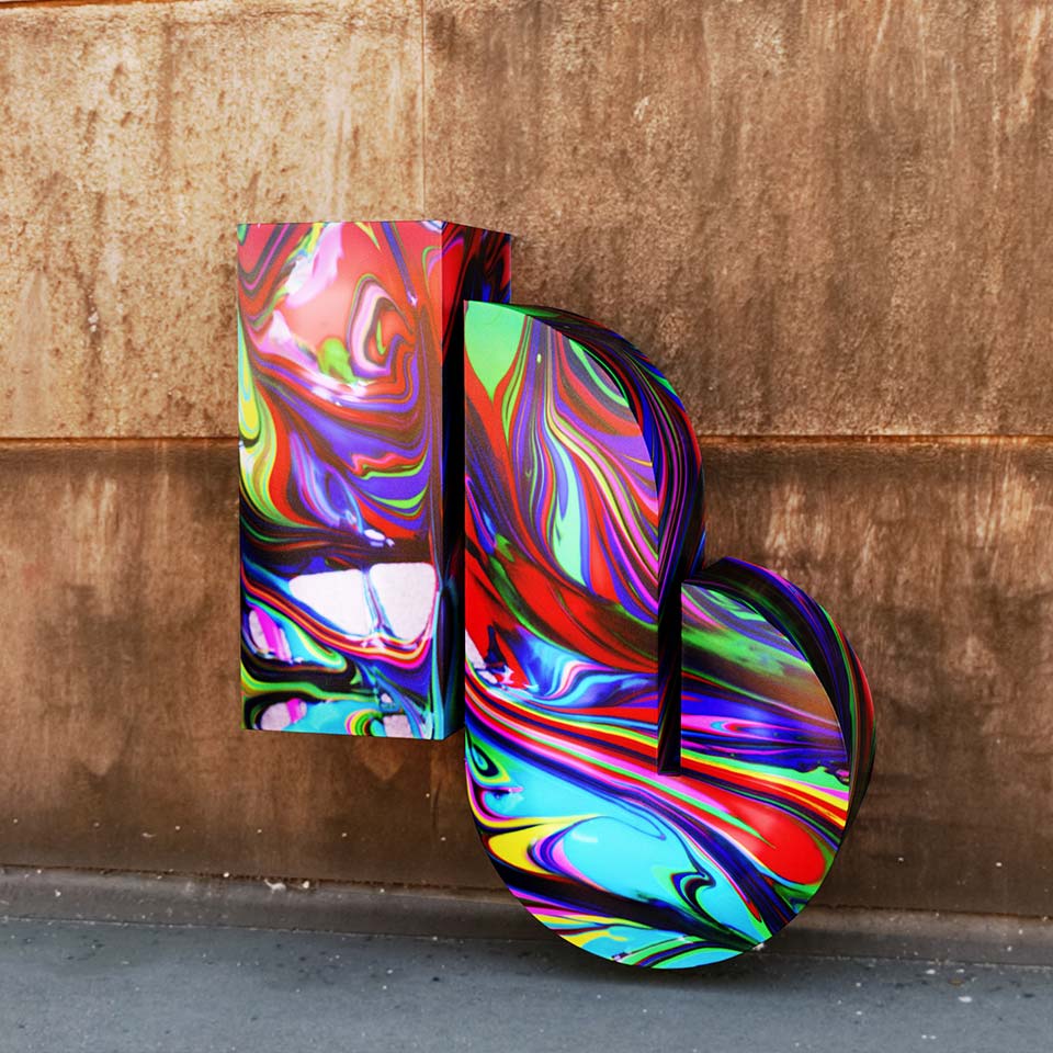
the solution:
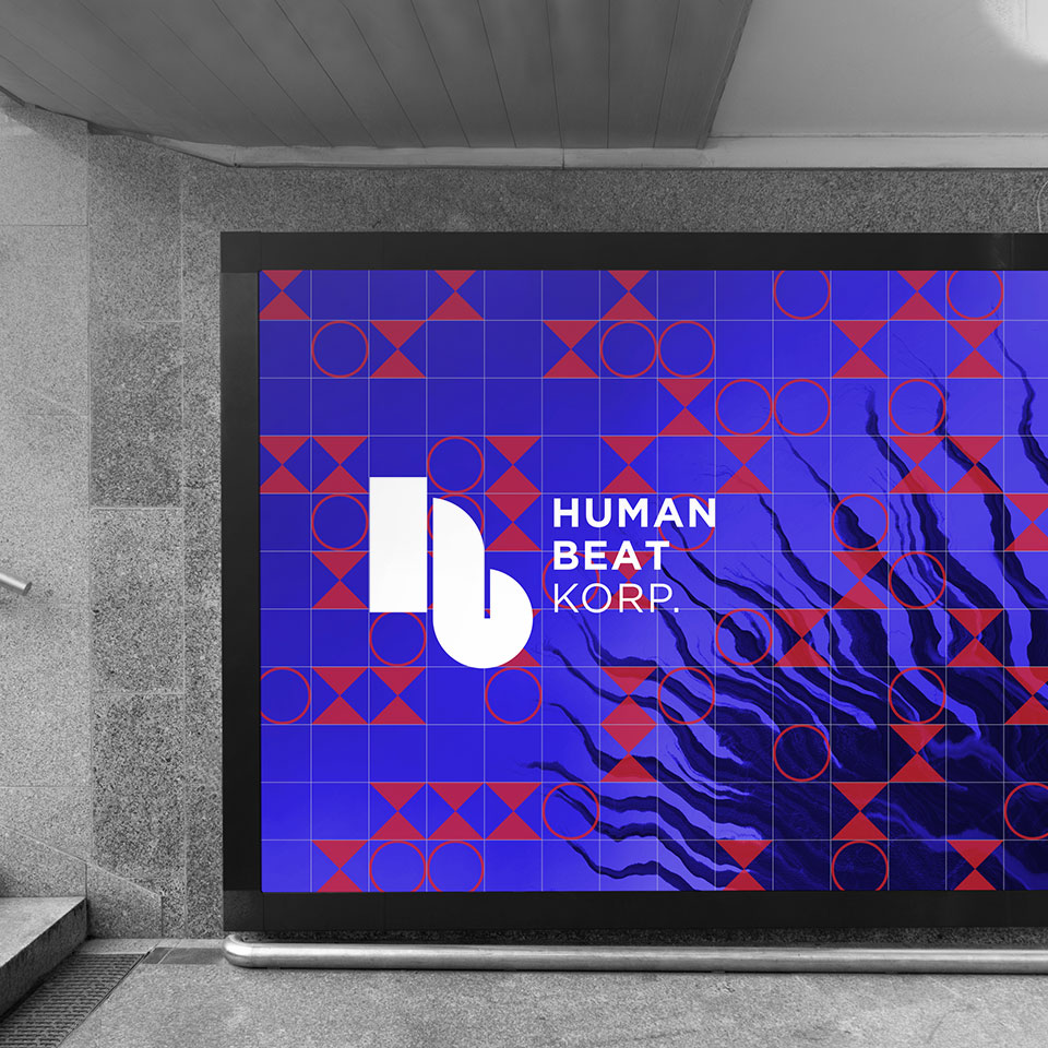
giving it a professional aesthetic that would trigger a subconcious assumption that these were in fact professional and accomplished creators who were journeying on uncharted waters.
