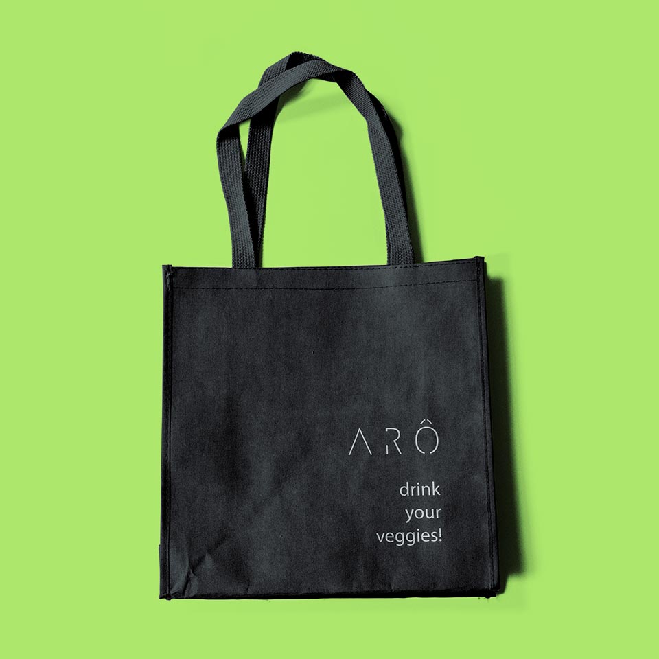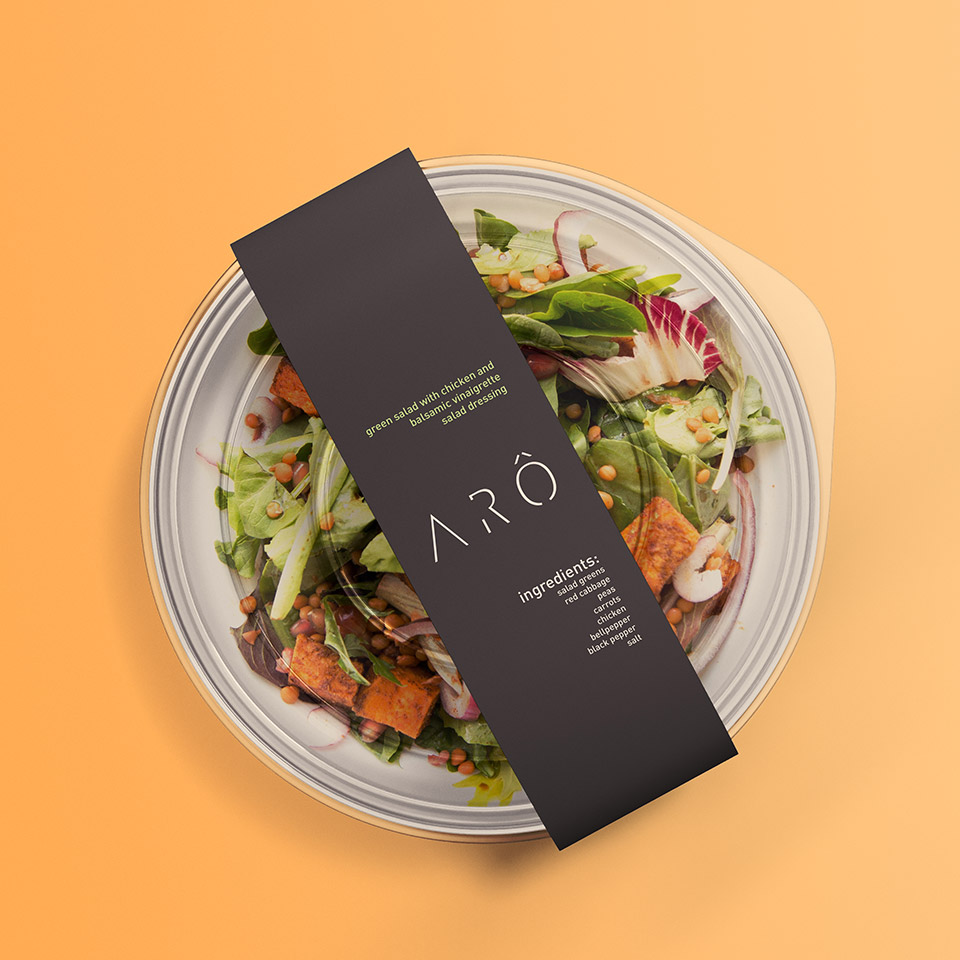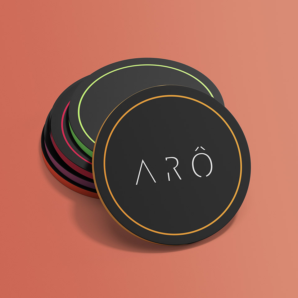
arÔ: brand identity & packaging
The goal was to introduce cold pressed juice to Sri Lanka as a healthier option to artificial drinks.
The dream was to inspire the tropical nation to look homewards for better, healthier food and lifestyle choices.
the problem:
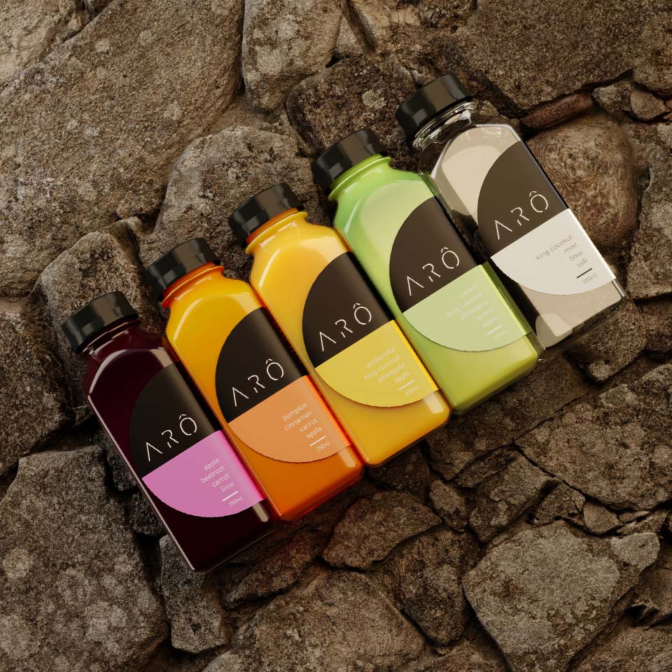
the idea of “veggie-juice” and it was proving to be a hard sale to make. They were used to flavoured juices and energy drinks with added sugar. Healthy veggie pulp just wasn’t appealing.
The shelf life was only three days, so it had to sell fast too.
The task seemed impossible.
the solution:
There were many It was important to ARÔ to inspire their consumers to make healthy and informed choices. That was their purpose.
By making it ‘cool’ to care about being healthy and knowing the quality of what they consumed. Having an ARÔ product in your hand meant you were smart, informed, healthy and successful in life. This guided our entire strategy, from design to product placement choices.
the solution:
As the Japanese proverb goes,
We shifted the focus from “veggie-juice” to something so premium that it
1. HAD to be healthy (assumption)
2. Looked so unique, it stood out (fact)
There was no doubt about what ARÔ sold but it was unique enough to stand out against any competition.
the solution:
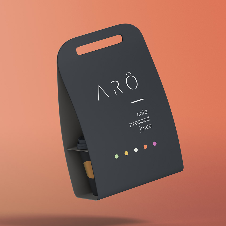
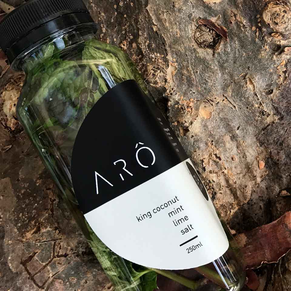
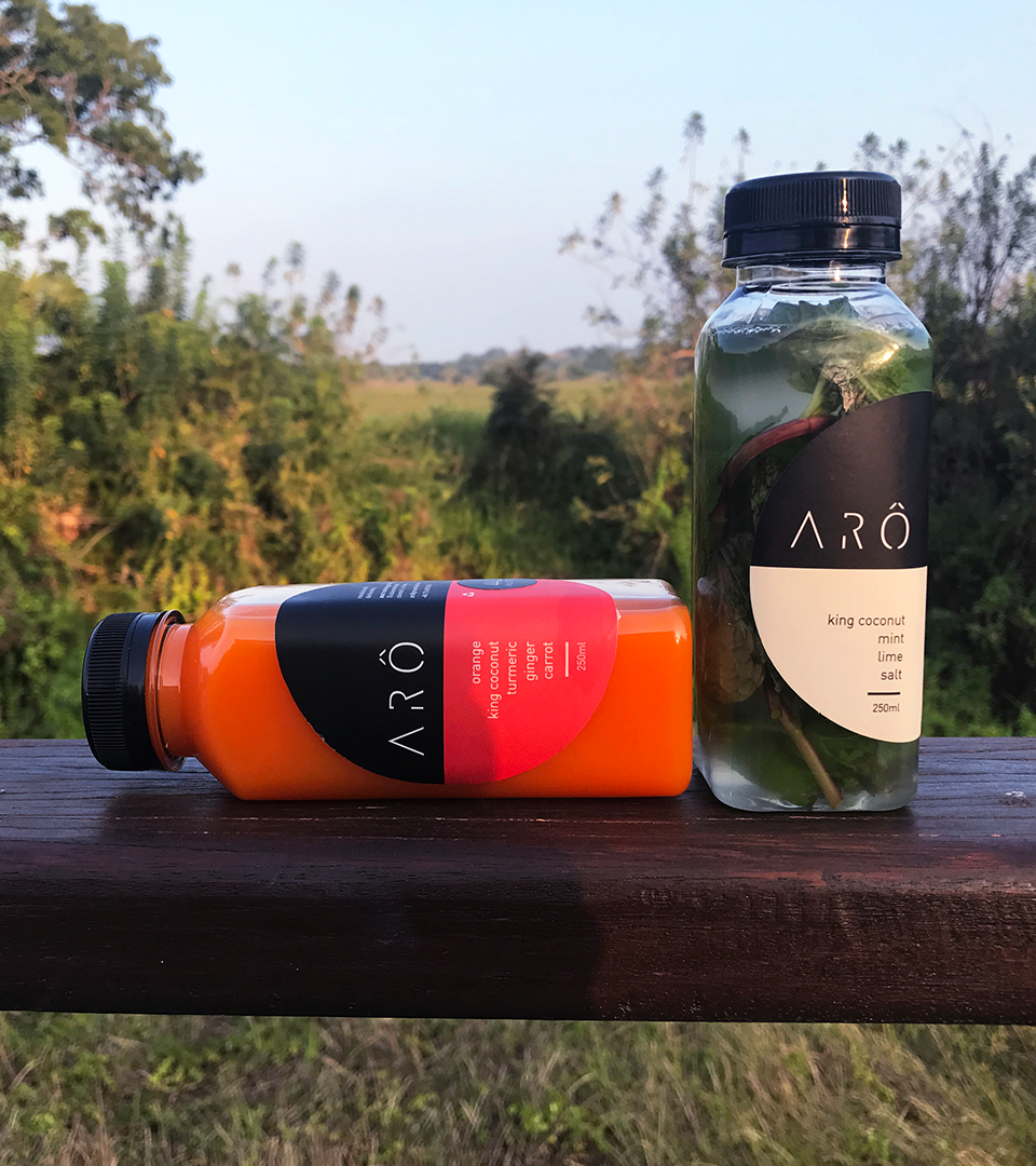
For these reasons, the bottle was left uncovered by the label. You could see the vibrance of the pulp and leaves through the bottle, which made ‘healthy’ look appetising. This was their advantage over other products with a longer shelf life.